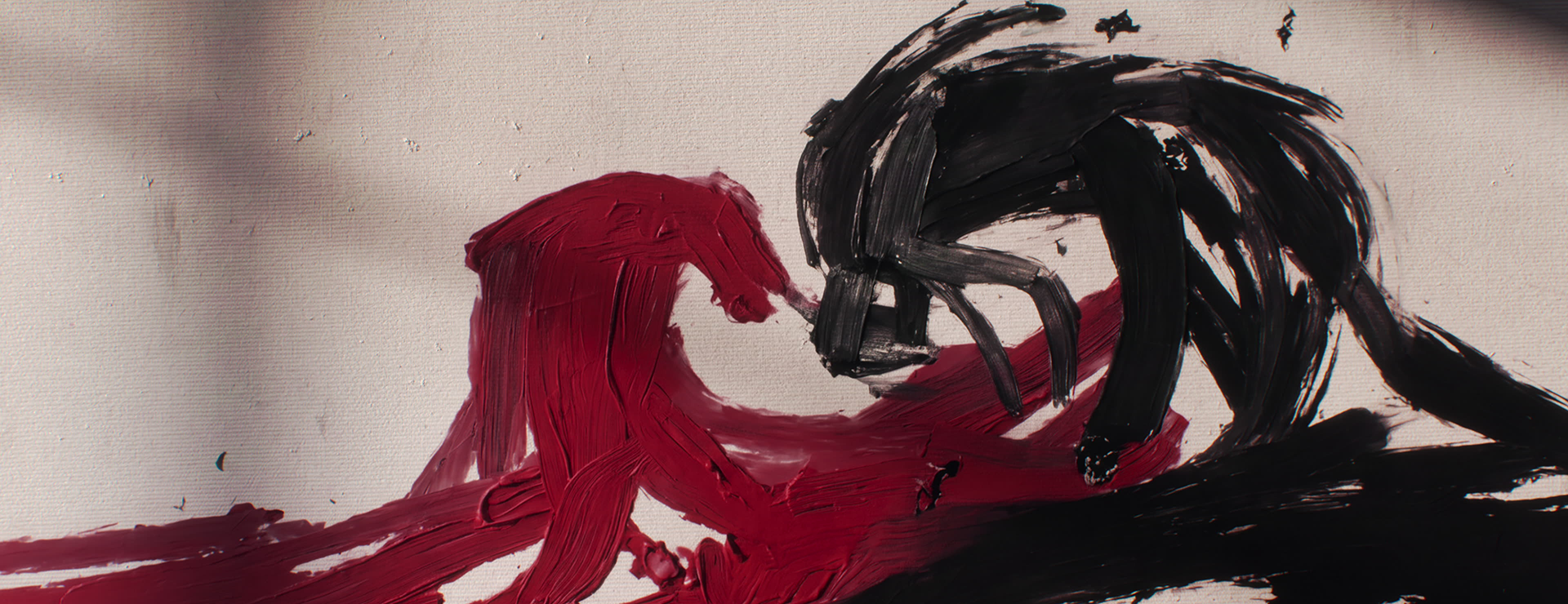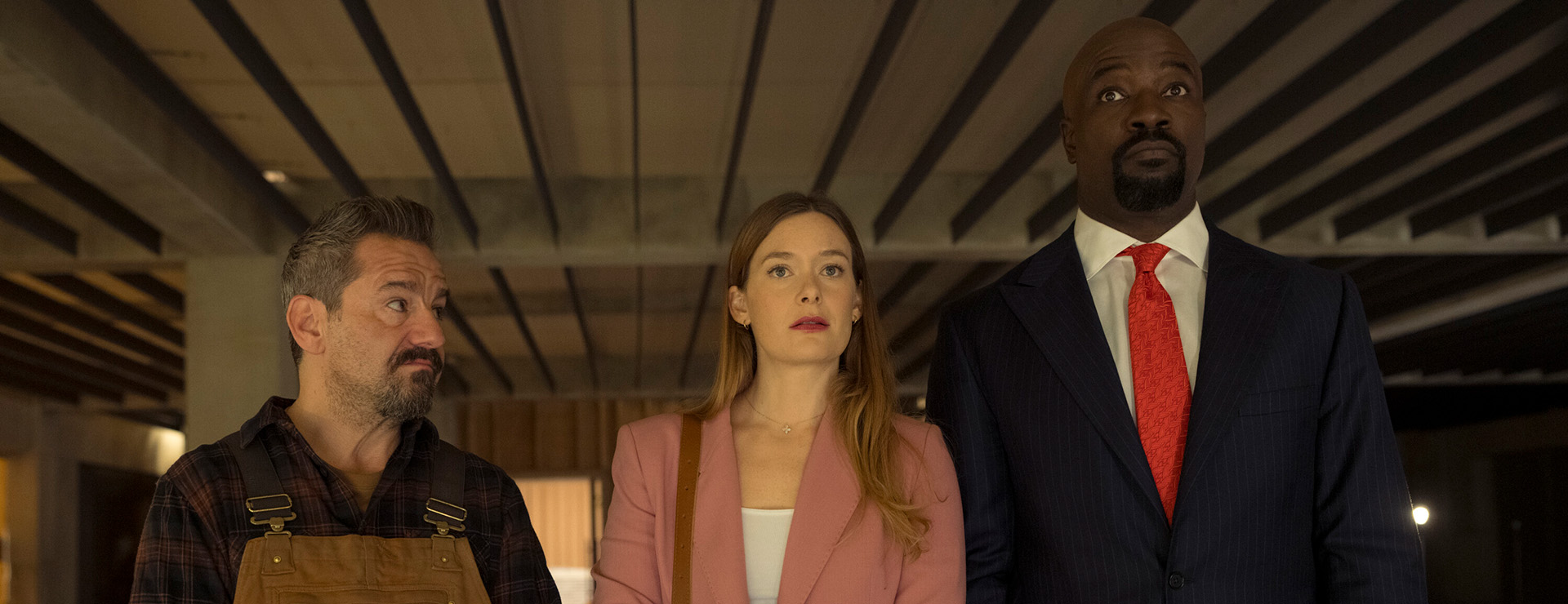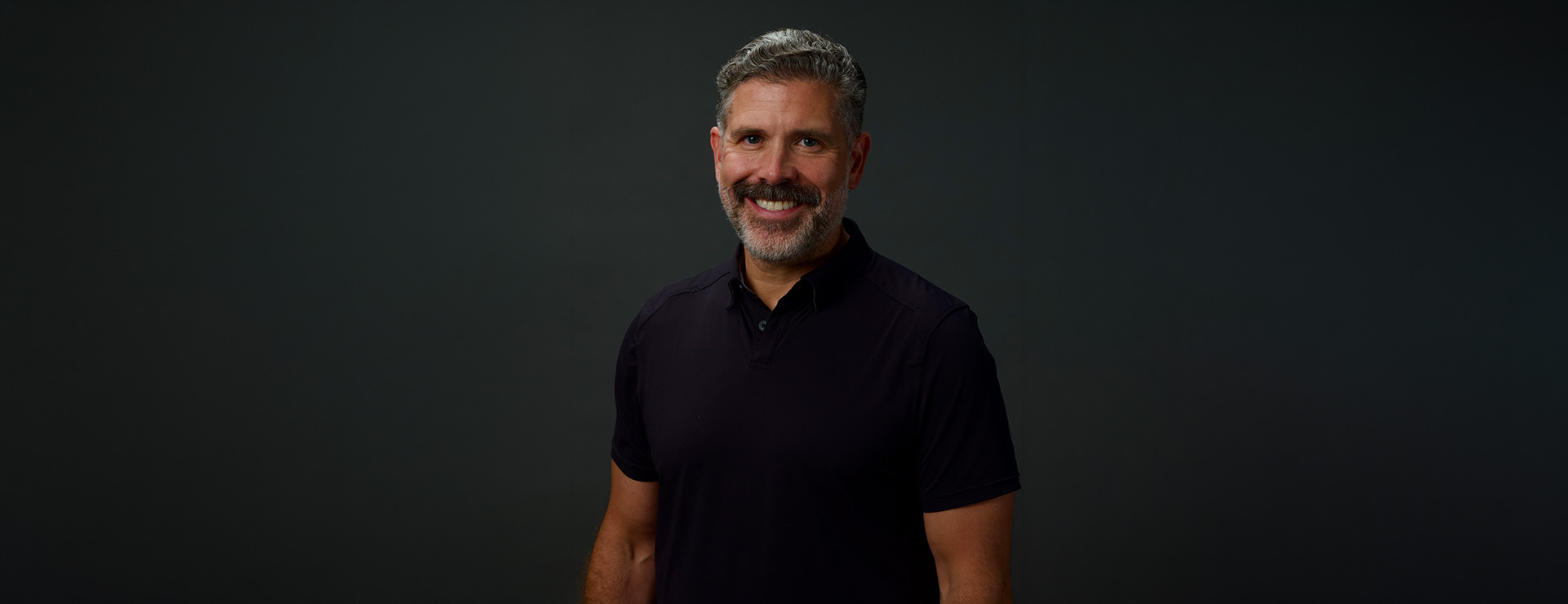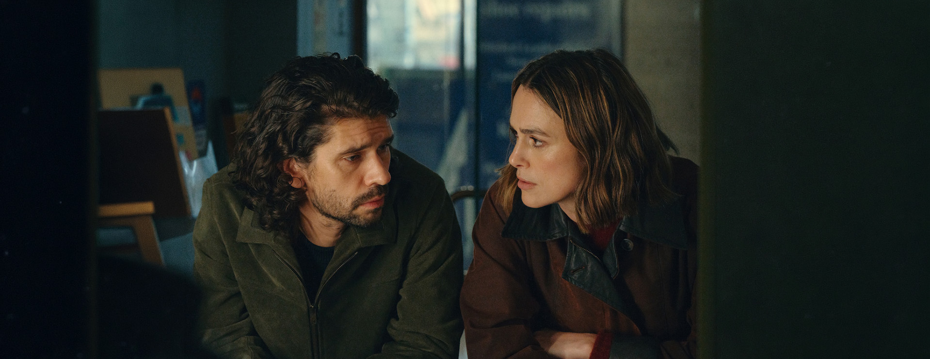


Imaginary Forces Creative Director Ronnie Koff is known for making main titles that absorb the viewer into the world of a show. The titles for Apple TV’s Foundation sparkle with stardust, while the titles for Apple TV’s Palm Royale go for a Saul Bass-inspired vintage feel. Wherever the show dares to travel, Koff is happy to hop on for the ride, bringing viewers with him.
This year, Koff added two more Emmy nominations to his resume: Peacock’s Ponies, starring Emilia Clarke (Game of Thrones) and Haley Lu Richardson (White Lotus), and Prime Video’s Young Sherlock.
Ahead of the Creative Arts Emmys this weekend, Koff joined Spotlight to chat about how he envisions main titles and what being nominated for an Emmy means to him.
Spotlight: You are a seven-time Emmy nominee for such main titles as Peacock’s Ponies; Prime Video’s Young Sherlock; Apple TV’s , Foundation, Dark Matter, Palm Royale and Hello Tomorrow!; and Hulu’s Candy. What is your guiding philosophy around creating main titles?
Ronnie Koff, creative director, Imaginary Forces: I feel like a title is often in service of the show and how you want to scaffold and support the show. I feel like a title should be something that is unique enough to stand out. I often describe titles as being like a short poem. Right before you watch a show, the main title is like an invitation that is designed to lead you into the show, but also offer you a little bit of visual information, ideas, allegories, things that build a level of intrigue, and often they build in nuggets that give you clues as to what's going to happen in the series. Those are the titles that I really like. The ones you watch every episode and take a little more from the title sequence each time and start to put things together. Often the titles that people really respond to are the ones that at the eighth or tenth episode, they're like, "Oh, that finally makes sense!” I love that aspect of them.
Spotlight: Each of the titles for Ponies and Young Sherlock are very striking, but neither looks like the show they’re attached to. How do you negotiate that? How far away can you get from the look of the show while still feeling completely relevant to it?
Koff: You want to have it dovetail into the series, but you also want to come up with a unique look that separates it. In many ways, you don't want it to look like the show because you want it to feel different and not like this is a sequence that you're watching that is in the show. It should feel like a title with its own visual language.
I bring a lot of my design interests – doing things like going to flea markets and browsing through Sears catalogs and looking at random things that I find or things in my childhood that I remember. I always try to weave in subconsciously the colors that I like and that flavor that ends up being sprinkled throughout. I take a little of my design history and my design interests, and I'm able to package it into these title sequences. I find that really exciting because I'm putting part of me into it.
Spotlight: One of the things I loved about the Ponies main title is the color palette. It feels very of the era. Can you just talk about how you chose that?
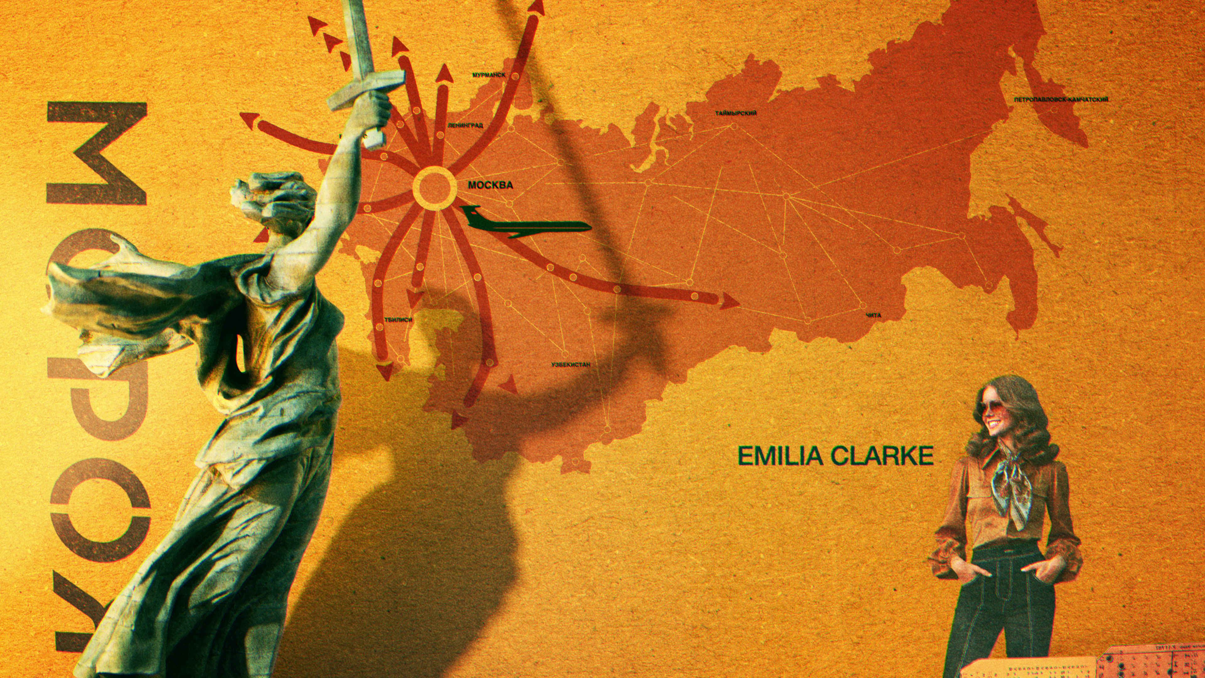
Koff: Spy shows tend to have a dinginess to them because they are talking about the clandestine. It feels like you want to be in the shadows, and it has a tendency to avoid color. This show takes place in Russia, and it is representing this idea of Western culture invading Russia at the time, this facsimile of Western culture. There was something about this consumerism attitude and the poppiness of these colors that was intertwined. Advertising back then was very poppy, and in the '70s you had these beautiful color palettes of yellows and blues and oranges. For me, it was a less obvious choice to go with something colorful. In a way, it made the clandestine aspect a little more surprising.
Spotlight: I felt like the palette also reflected the fashion in the show.
Koff: The show had this beautiful palette within the show in regard to fashion and art direction. If you get a chance to do a title sequence that way, that's just a blast.
Spotlight: The color in the sequence felt very saturated to me. Did you do that intentionally and if so, why?
Koff: A lot of times people want to represent an era based on the the impression of what that era should be, and they'll desaturate the colors because when they watch old stuff on TV, the color looks a little desaturated because the resolution wasn't very good at the time, or the quality was degraded when it was transferred onto tape.
I want you to feel like you're seeing it within that time period, not as a reflection on the time period, which comes with everyone's own perception of how they see it. It's subtle, but having the saturation in there, in my opinion, is just more true to being immersed in that time period.
Spotlight: The way you reveal the logo is also cool with the star coming out of it.
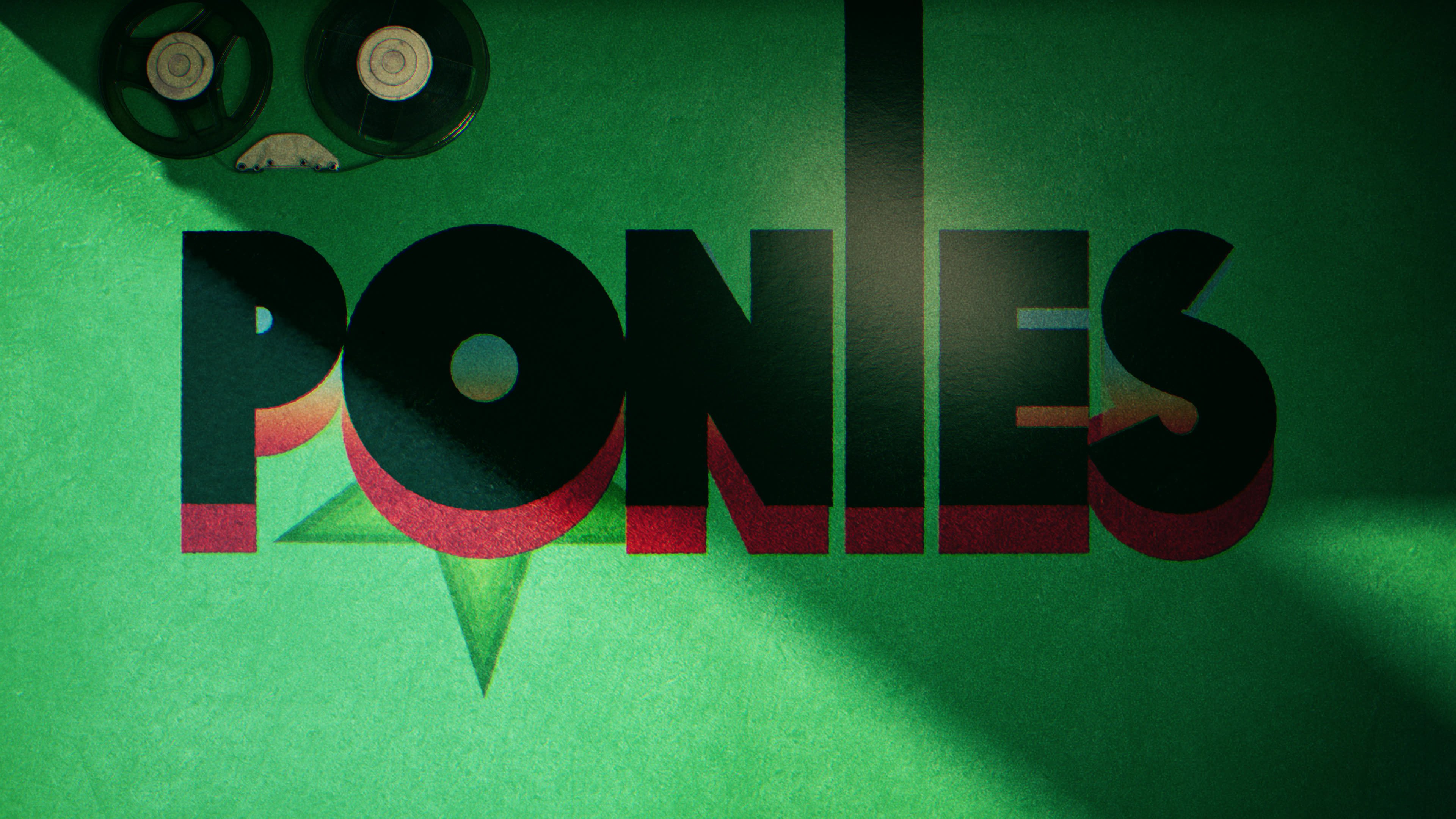
Ronnie Koff: I used a lot of album covers to come up with inspiration because in the show there's this whole idea of albums being used as they're delivered from America to Russia, so it's a theme in the show, which I don't want to give away if people are going to watch it. But it's not just about design, it's also rooted in ideas.
Spotlight: In both Ponies and Young Sherlock, it feels like you are taking the viewer on a journey even though the looks of those titles are very different. What was your thinking there?
Koff: They are both created in a 3D program using a single-camera effect and there are no edits in either of them. But if they were shot, it would be just a single camera shot.
Spotlight: So both of these titles are designed to look like a oner?
Koff: Yes, exactly. The reason I do that is to separate the title from the grammar of the show a little bit, or the editorial nature of the show, so it has its own distinctive point of view. And when you use this single-shot format, you get to design every opportunity, every milestone that you hit along the way in the storytelling. I also often feel like the music flows a little better in a title sequence with a single camera. I have a tendency to really embrace those moments and connect them together in a way that feels very deliberate and designed. Often, I find that if you cut something up, it doesn't deliver the same satisfaction as the surprise of being able to get from place to place to place without tricking the audience with a cut. I'm not saying beautiful title sequences can't have cuts, but there's a joy that I have in the magic of the flow. A single shot where you get to all these points and you do it in a surprising way – that's what Young Sherlock did. It used the camera as a magic trick to get between things.
Spotlight: I find the titles for Young Sherlock, in particular, to be very unpredictable. Nothing ends up where you think it’s going to.
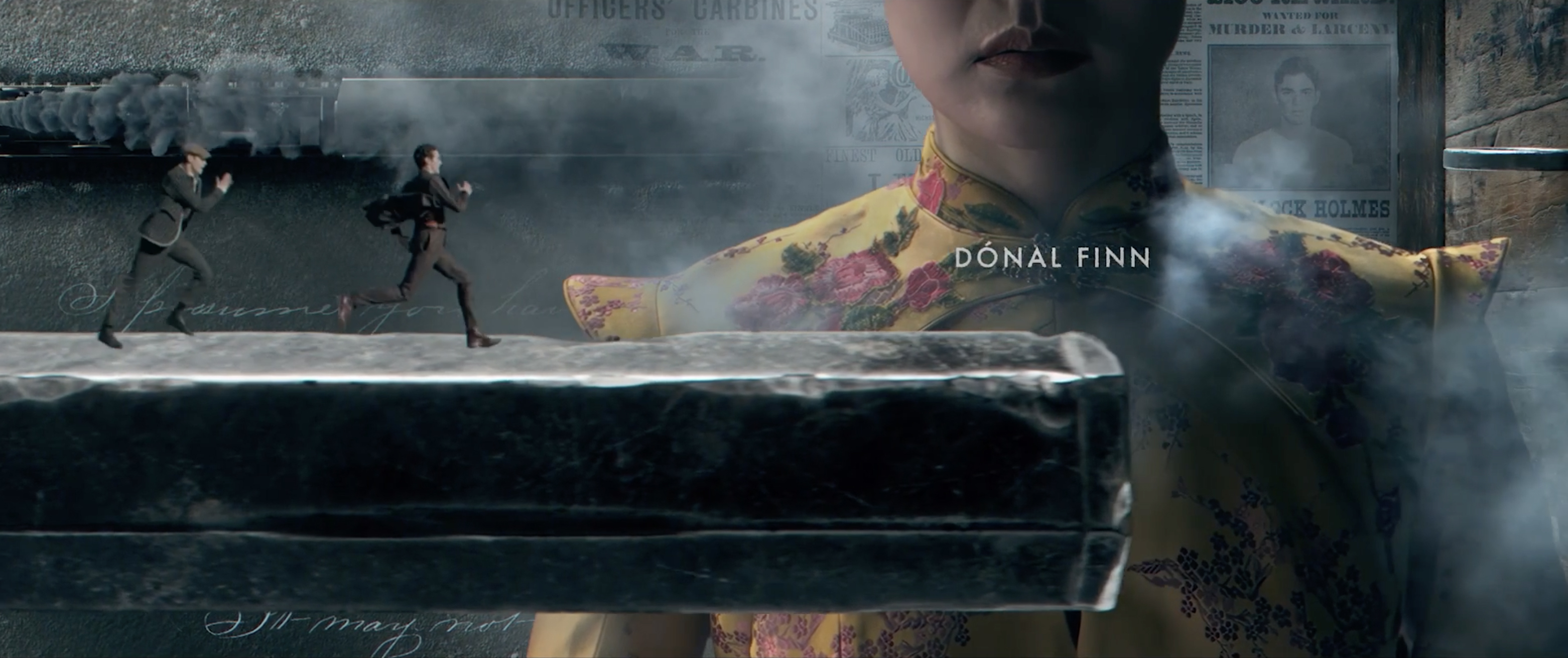
Koff: Exactly, and that all relates to the theme of the show. There was something about Sherlock's point of view that was really interesting. How he sees stuff and how he connects things in his mind – so the whole idea of having everything connected in one flow is like his stream of consciousness. I wanted it to feel like they were seeing things from his point of view and I think people don't see that when there are cuts.
Spotlight: Something that seems challenging to me about being a title designer is that you need to bring a different motion-graphic style, a different palette look, to every sequence.
Koff: I do feel like titles are style-agnostic, but the choices and the point of view and the taste are something that a title designer brings to the solution. Everyone brings their own taste, and I'd like to think that I bring my own twist on things. That certainly my taste in art and design is always in my titles, but I also always want to design in service of what the show needs to have in front of it.
Spotlight: So for both these titles, did the showrunners bring briefs to you, or did you have free reign to do what you wanted?
Koff: The Ponies producers just wanted to do something that was interesting, and they loved the idea. They showed me this production book of all of these really interesting gadgets. There were all these cool little cameras and things hidden in books and piano keys. It was filled with all these objects that I could play with. Then they showed me the wardrobe and the color, and I came up with this treatment for it.
Spotlight: What about Young Sherlock?
Koff: Same thing. We don't want to be predictable. The show is a gem. It's a really good show, and they wanted to do something unexpected and surprising, like surprising shifts in scale. The music on it is so different from what you'd expect from a Sherlock Holmes series.
Their brief was more about creating something that feels kinetic and high energy. They wanted to make sure that it didn't feel like the old version of Sherlock Holmes, where it might have been a little more pensive and investigative. There's grit and a fast-paced nature to this series.
Even though they're tonally different shows, there's a sense of joy in both of them, and I wanted to convey that in the title sequences too. You're watching shows that have their drama and dark moments, but they are also something to escape into. Each title presents this idea of escapism, and all those things – like color and shifts in scale and objects looping around into something else – that's all about keeping it fun.
Spotlight: I think both of these titles do a good job of luring you in as a viewer. You think, ‘this is a really cool title, so the show must also be cool.’ You can watch these many times – and I have – and get something new out of them every time. It’s almost like watching a riddle.
Koff: You want to give people something to think about, but what I also like about it is that I am able to tell a story while conveying these clues that people can later reflect on. There is that skip button there too, that you want to somehow convince people to avoid using. It gives me a little bit more of an incentive to try something different in a title sequence, because people are immediately wanting to get to the next episode. What can I do to engage them or to make them want to continue watching the title? That's why I don't often do editorial sequences anymore because I feel like those are a little plodding, and I like the viewer to feel like they are carried away by the sequence.
It's like a hypnotist when they're holding the thing up. I want the camera to feel like it's continually moving and pulling you onto this journey and luring you in, so you don't think about skipping it. I often feel like cuts break that spell, and cause the viewer to look away. I don't know if it's manipulative, but I'm trying to capture someone through the motion of the camera sweeping around in a single move, and have them just stay fully invested in the piece, and not have them think about the time they are spending with it.
I think main-title work is the best thing you can do as a designer.
It’s storytelling, it’s design, it’s animation. You have the time to tell a story in a very beautiful way. They have all of these ingredients that, in my opinion, are the most interesting form of short-form content on TV.
Spotlight: How has being nominated for seven Emmys changed your career?
Koff: Well, I haven't won an Emmy yet. I would say the nominations build the fire that makes you want to win. Hopefully, one of these will click with enough people that it'll win the Emmy.
I have the chance to use my design skills and have people see it and be aware of something that could be a cultural milestone type of show. You never know how something is going to impact the culture. When Imaginary Forces did Stranger Things, that was just an amazing confluence of a beautifully designed title, great music and a great show. That logo was a little cultural blip. It's a very cool craft because you get to be part of that conversation.
Someone sent me an email about Ponies, and said they loved the title sequence and that it made them want to know if the story of Ponies was real. She looked it up and learned that these devices did exist and there were people that they referred to as “people of non-interest” (PONI). I like that the titles caused this person to be that interested and really investigate the real nature of what happened in the early ‘80s. Any time you inspire someone to dig further is a win.
Regardless of how a show exists in the world, I still get to make a beautiful piece. These are two very good shows that I'm very proud to have worked on.